Smooth progress indicator with CSS

Recently I worked on upload button feature using ActiveStorage::DirectUpload features of the Ruby on Rails web framework. There’s nothing too fancy here, but I got fascinated how nice it was to implement upload progress bar with the help of modern CSS features.
Key features to implement it were:
- CSS variables and their manipulation from Javascript implementation to reflect progress to the styles
- CSS transitions for smooth animation
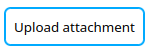
Simple generic example
Full example is available in Codepen, but let’s go through the code in smaller steps.
Smoothly animated progress bar using CSS variables and transitions.
1. Basic custom button styling
We start with just the <button> element and custom class for it.
<button class="upload-button">
  Upload file
</button>
And some custom styling with CSS variable based design tokens.
:root {
  --primary-color: #0af;
  --button-border-width: 2px;
  --button-border-radius: 0.5em;
  --button-padding: 8px;
}

button {
  padding: var(--button-padding);
  background-color: inherit;
  border: var(--button-border-width) solid var(--primary-color);
  border-radius: var(--button-border-radius);
}
2. Progress indicator positioning
Progress indicator is created as ::after pseudoelement, but first we define
upload button component’s positioning to relative to be able to anchor
pseudoelement absolute positioning in relation to the main button component.
If we wouldn’t do this absolute positioning would be done in relation to the
closest parent DOM element with position other than the default static or if
none are found the main document itself.
.upload-button {
  position: relative;
}
Then we create pseudoelement by assigning content to it and position it to the
bottom part of the button taking about 75% of the empty padding area there. CSS
calc() function is a handy helper to calculate height and top position based
on the variables used to style button element.
.upload-button::after {
  content: " ";
  position: absolute;
  height: calc(var(--button-padding) / 1.5);
  left: 0;
  top: calc(100% - (var(--button-padding)) / 1.5);
  background-color: var(--primary-color);
  border-radius: var(--button-border-radius);
}
3. Updating progress
Progress is visualized as ::after element width from 0% to 100%. This is done
using CSS variable which is updated from JS callback.
First variable is initialized and used to define element width:
:root {
  --upload-progress: 0%;
}

.upload-button::after {
  width: var(--upload-progress);
}
In the Javascript side we should have some kind of event or callback mechanism which would provide information about progress. In the Codepen version there’s mock class, which provides completion percentage to the callback:
const button = document.querySelector(".upload-button");

function progressCallback(newProgress) {
  button.style.setProperty("--upload-progress", `${newProgress.toFixed(2)}%`);
}
4. Smoother transition
At this point progress bar movement is a bit jerky, but it can be smoothened using CSS transition.
.upload-button::after {
  transition: width 200ms ease-out;
}
5. Estimate finishing time to get smoothest animation
- Define transition delay using CSS variable
- Record start timestamp
- Use progress value and current time to estimate total upload time
- Update CSS transition delay based on the total time
:root {
  --upload-progress: 0%;
  --upload-transition-delay: 200ms;
}

.upload-button::after {
  width: var(--upload-progress);
  transition: width var(--upload-transition-delay) ease-out;
}
function progressCallback(newProgress) {
  const spent = Date.now() - start;
  const total = Math.round(spent / (newProgress / 100));
  button.style.setProperty("--upload-progress", `${newProgress.toFixed(2)}%`);
  button.style.setProperty("--upload-transition-delay", `${total}ms`);
}
ActiveStorage integration
Using this approach with ActiveStorage is really straightforward and
documented extensively at the Rails guides. In the
nutshell:
- Create custom
Uploaderclass which wraps theDirectUploadimported from@rails/activestorageNPM library - Get DOM element reference for the element you use to indicate progress ie.
.upload-buttonin the above examples ready before starting upload to avoid unnecessary DOM queries - Record start timestamp as uploader property
- Use
directUploadDidProgress(event) { ... }callback to update CSS variables--upload-progressand--upload-transition-delay
directUploadDidProgress(event) {
  const ratio = (event.loaded / event.total);
  const spent = Date.now() - this.start;
  const total = Math.round(spent / ratio);
  const percentage = (100 * ratio).toFixed(2);
  button.style.setProperty("--upload-progress", `${percentage}%`);
  button.style.setProperty("--upload-transition-delay", `${total}ms`);
}
Why use variables instead of manipulating styles directly?
- CSS variables provides means to separate concerns. This JS handles interactivity and CSS the visual presentation in the same place.
- Pseudoelements can’t be accessed through JS DOM queries. CSS variables provides a way to provide information affecting pseudoelements. Using pseudoelement instead of creating additional DOM elements enables us to have more semantic DOM without non-content visual presentation elements.